Overanalyzing The New Shin-Godzilla Design
I'm back and ready to pick apart everything about the latest Godzilla design for the 2016 Toho Pictures film 'Godzilla: Resurgence.' This is an opinion piece (specifically my opinion) and I’m sure there will be a lot of fans out there that will harshly disagree with my thoughts on the design. Nevertheless, I have a lot to say about specific choices they made, for better or worse, and I think that some of you out there will agree with me. I’m going to break this down by parts of his body and then talk about the design as a whole at the end. Starting off with the-
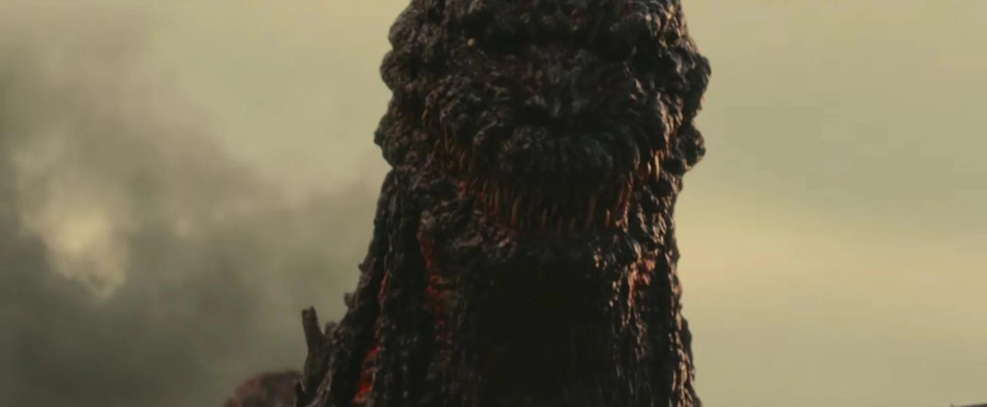
Head
What I like: I really enjoy the return of the googly eyes from the original 54' puppet that was used for all the close-up shots in the original film. His teeth being so sporadic and different than any design for this creature that has come before is also a plus for me.
What I do not like: Unfortunately, I have more dislikes than likes for the head design we got. First decision I have to question is why you would make a reference to the puppet from the original film with the head design instead of the much better looking and much more universally liked suit from the same film. This facial structure doesn’t really work for me either. I can talk for days about how the pulled back mouth makes no sense anatomically speaking. Why did his whole skull structure change while regenerating from whatever awful thing happened to him? I can understand the jawline going that far back and looking like it does except for one thing, there shouldn’t be any teeth that far back on the jaw! I’m also okay with the huge amount of teeth in general, but what I’m not fine with is the blatant disregard for how exaggerated the skull looks. The mouth just looks really awkward when he opens it (more like a Muppet than an actual creature). As I mentioned above I like the googly-ness of the eyes, but I don’t like how small they are. I would prefer if they were 25% bigger than they are now. Oh, and one last thing about the head…
It really has problems from certain angles, especially from the front. This isn’t the first suit design that looks a bit odd forward facing, but I was hoping that they had evolved to the point of tweaking where they could get it looking good from all angles.
He especially looks silly from the front when he opens his mouth. His head also lacks any real definition and is a bit too large for his body.
Chest and Neck
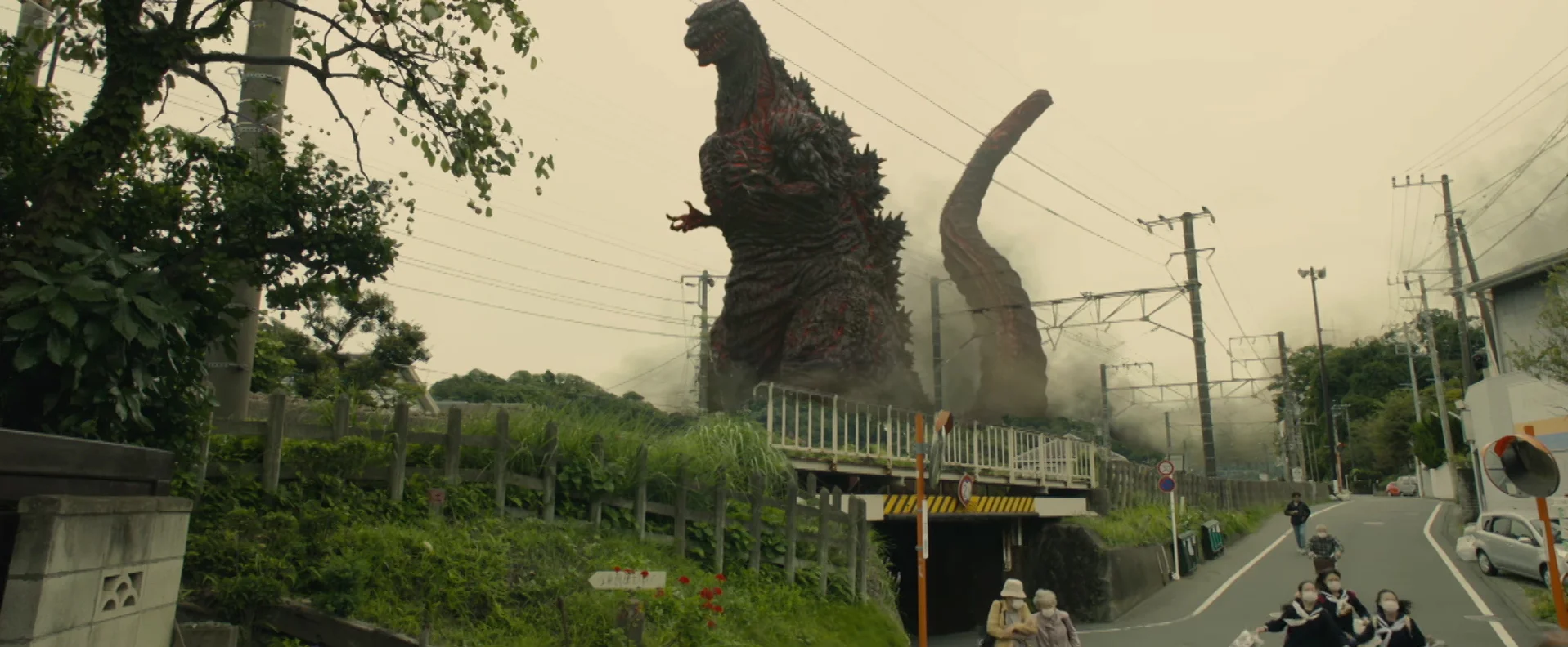
What I like: Here is where we get to some good stuff. His skin is amazing! I love how it looks like burnt flesh that is either trying to regrow or could just fall off because it is barely attached. Really, it's another call back to the 54' design and the horrors of the atomic bomb in general. I actually do like the chest spike which seems to change sizes depending on the angle that you look at it. I know it contradicts everything I said above with the whole staying anatomically correct speech, but hear me out. The chest spike could explain Heisei Godzilla’ s weird third boob thing in the middle of his chest.
What I don’t like: His neck is a wee bit too long and is surprisingly devoid of much burn/scar tissue (other than the weird gill like structure toward the back half of his neck). Other Godzilla designs have had long necks as well, so this specific nitpick is just a personal preference.
Arms and Hands
What I like: I like that they keep the burned off flesh look from the torso and once again, I love the call backs to 54' but…
What I don’t like: ...the arms are super tiny! 54' had small arms as well but they at least looked like they could grasp onto something and pull it down.
The new arms look vestigial, as if he evolved or mutated one step further he wouldn’t even have them. His hands also seem to have very little movement with the bit of footage that we have seen so far. As of right now, I don’t think he’s going to be using these to do much of anything in the film. One last note, they seem to be stuck in a strange upward position which adds to the overall creepiness of the design.
Back & Dorsal Plates
What I like: EVERYTHING! I love the red glowing parts in the crevices of his spines, and the fact that he has five rows in general. I love that his spines are not all uniform to each other and that they look like they are continuing to grow.
Legs and Feet
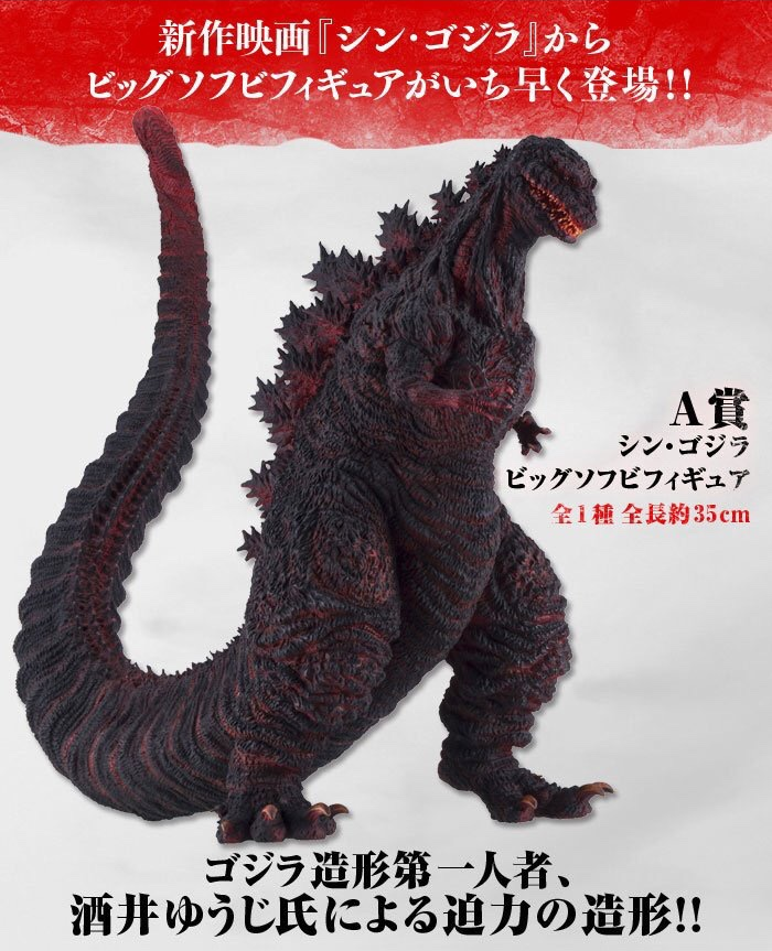
What I like: I like the basic structure of his legs and the fact that he has four toes. The saurian influences are extremely apparent with how his lower leg contorts.
What I don’t like: They really missed the mark with the actual feet… I really like what they were going for, all except one huge thing they forgot when designing a creature with saurian features; dinosaurs still had heels!
The oversight makes him look like he is standing on his tiptoes at all times and pretty unstable. I do want to point out that it is completely possible that the toy (only good look at his feet available) is supposed to be taking a step with his left foot. If that is the case, my complaints about the feet are null and void. Though I’m also not the biggest fan of the claws on his feet being curled upwards either. They almost look like they are glued on to the toe instead of it being an actual part of the foot itself.
The Tail
What I don’t like: I really don’t have much positive to say about the tail, actually. It's so thick that the rows of spines along it look even smaller than they normally do on other Godzilla designs. It has a very strange group of bulky ridges to it that make it look trapezoidal in shape. The tip of the tail has a weird bulge to it that almost looks like it would evolve into some sort of ankylosaurian weapon. Then there is the now infamous whale skeleton…
This may get explained in the film, but for right now it's just strange. The length isn’t really a problem for me, but the way it flops around up in the air through most of the footage doesn't work for me. It should be versatile, but it is used mostly for counter balance. Final thought on the tail: can we officially move away from the rounded end of the tail design? Even the 54' Godzilla design had a pointed tail (which they make multiple references to within this design as stated above).
Overall Thoughts
Overall I feel like this take on Godzilla is a little bit over-designed in some areas (mouth, tail, feet) and under-designed in others (head and arms/hands). The overall look really does evoke the 54' Godzilla, but the extremely awkward head design and the strange proportions are very off-putting.
So, now for the big question: do I like it or not? I actually can’t decide, and I know that seems like a cop out, but let me explain. There are a lot of design decisions that completely baffle me, but may be made clear through the story of the film. It is still possible that he is healing throughout the film and his design will change significantly. As a one-off film I think it is perfectly acceptable, but I hope that they look back at some of their more popular designs (not the hand puppets of them) for future films in this newly revived Japanese 'Godzilla' series.
What did you think of the design? Do you agree with my thoughts? Do you want to take up your pitchforks and hunt me down? Let me know in the comment section below.


